typography

if coney island were a store

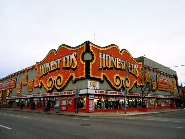
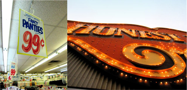
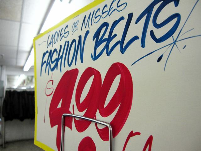
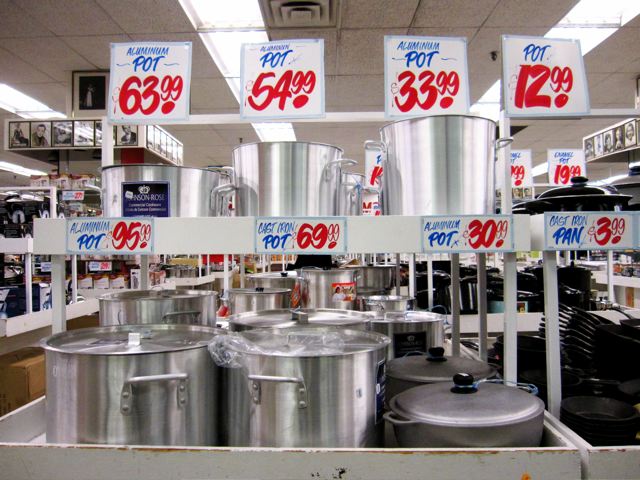
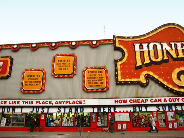
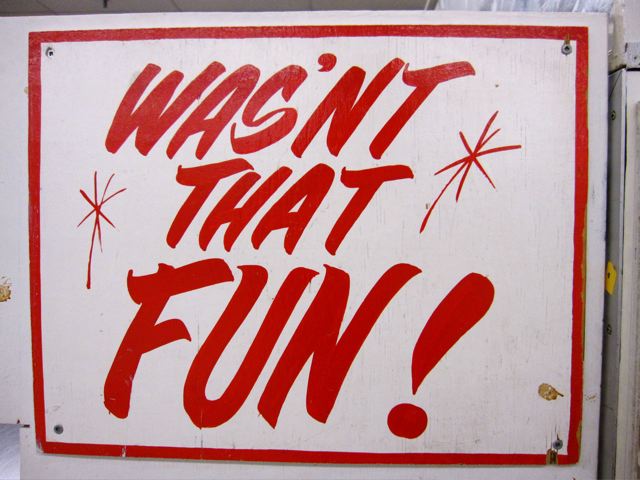
Take the kitschy, retro aesthetic of Coney Island in Brooklyn, NY and apply it to a department store in Toronto, Canada and you would get Honest Ed's. The façade alone had me transfixed. It's a carnival alright. And it's the only structure on the street and neighbourhood that looks like it could belong in Coney Island (or even Time Square). To briefly describe Honest Ed's: it is a discount department store that seems to have, well, everything. The fact that this place has been around for almost 62 years tells me that there isn't a deliberate attempt at kitsch. Things simply have not changed for years! Apparently, the interior store signage has been hand drawn by the same man for decades. I wonder if anyone has ever attempted to create a typeface based on it. 

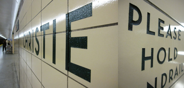
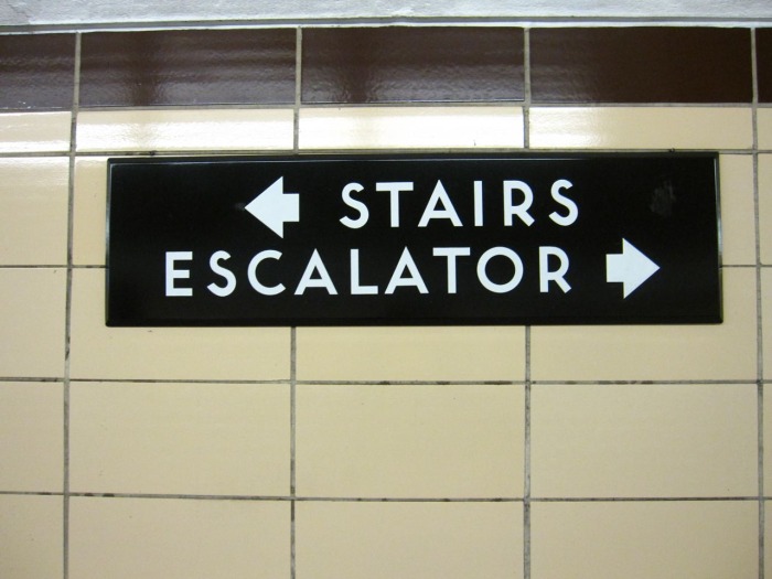
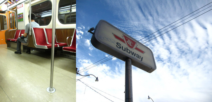
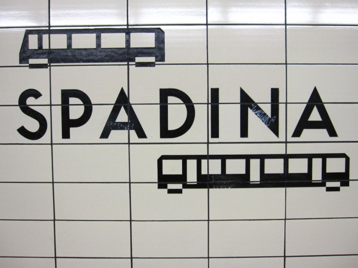
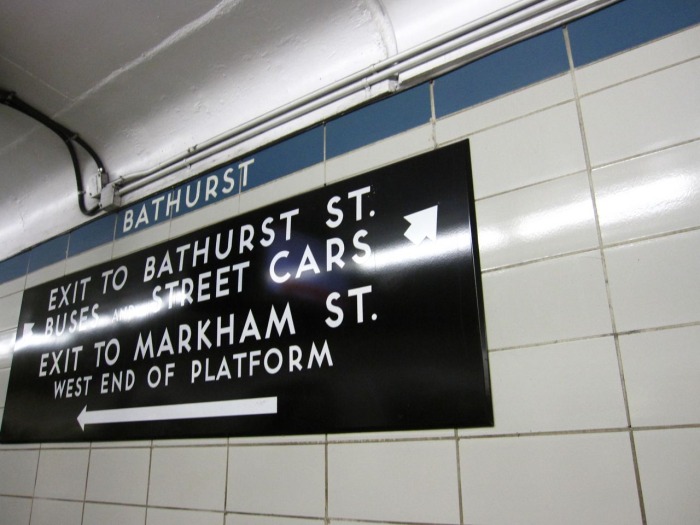
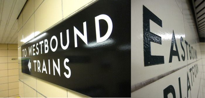
toronto subway signage : name that typeface

Unlike New York's subway system (set in Helvetica, of course), Toronto's subway system signage is set in a typeface very similar to one of my personal favourites: Neutra. It possesses the same mid-century modern qualities but it's not identical. For instance; the bottom strokes (aka legs) of the letterforms are different – they don't finish off flush to the baseline the way Neutra's does. Anyone know the name of it? 


for the love of neutra

Richard Neutra is definitely at the top of my list of all time favourite architect/designers. He even worked briefly under Frank Lloyd Wright (also at the top of my list) before starting his own studio. He was a proponent of "warm" modernism, proving that modernist architecture did not have to be sterile. He was also known for extending architectural space into the landscape outside. I love that about his work. I am particularly in love with his design of the Kaufmann House in Palm Springs (which apparently was auctioned off by Christies last year for nearly $20 million). I would model my own ideal home design after this house...and I would include the swimming pool, of course. This may require that I move to a warmer climate...

I'm also a huge fan of the boomerang chair design. It's gorgeous in that mid-century way. What's not to love about it?

And if I may truly geek-out here, his design of the NeutraFace Typeface is yet another reason I'm such a great admirer. It happens to also be of my favourite fonts. I also love that House Industries came out with the new Slab version too. It absolutely makes sense to me that architects design typefaces well. The clean, modern aesthetic of his mid-century modern architectural work is nicely translated into this font. I was so excited when another "warm" modernist, Ray Kappe, used Neutra as the font for the house number of pre-fab design of Living Homes. How perfect.

Kaufmann House photo from The Los Angeles Times


Kaufmann House photo from Architectural Digest


Kaufmann House photo from The Los Angeles Times

Kaufmann House photo from BusinessWeek.com


Boomerang chair photo and typeface samples from House Industries

sexy typography

Designer Juan Carlos Pagan did this series of fun typographic posters, Naked Type. I must say that I can relate to the notion of typography as being sexy because it can be (insert silly snicker here). It doesn't even need to be naked to be so. I mean, who doesn't love a well-formed ampersand? At any rate, I thought these were well done and sufficiently amusing...


ebon heath: on visual poetry

Ebon Heath is a Brooklyn-based artist/graphic designer with a love of typography and an interest in giving a dynamic, three-dimensional and physical representation to all the "visual noise" that permeates everyday city life. His work is very much influenced by hip hop. Both lyrically and rhythmically. He sees the work as a way to "cleanse or release content contained inside us." 

His work honors *craft* in a heavily digital world. I love the statement he is making. And what a gorgeous statement it is. 

Read the article on Yatzer to learn more.


All images from Yatzer

quiet = beautiful packaging design


I adore this packaging design for massage oil. I came across it on Communication Arts magazine online. Goes to show exactly (what I believe myself) that not everything has to be loud and obnoxious to be beautiful. In this instance, it's very appropriately quiet considering where these products will live – the spa. I think the typographic design couldn't be more delicate, spot on and gorgeous.