architecture

the goodwin nyc : opens this week

I'm thrilled to announce that The Goodwin officially opens its doors this week. It's been an amazing project to have been part of. It's such a joy to see everything come together. A huge congratulations to owners Andre Jones, Richard Wise and the entire team!

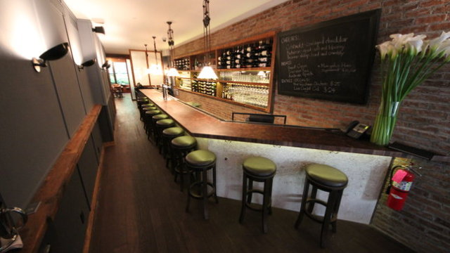
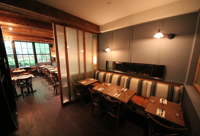
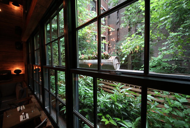
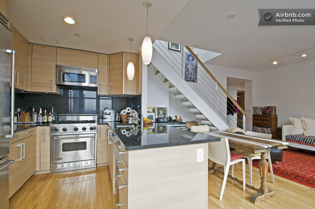
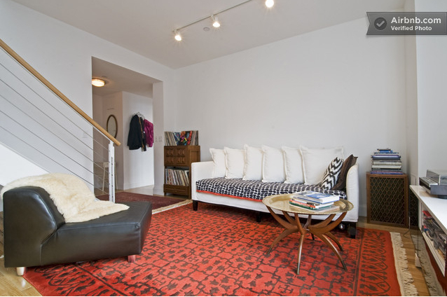
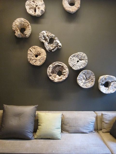
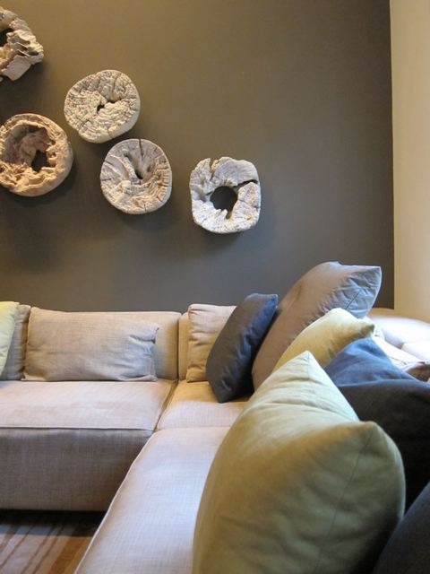
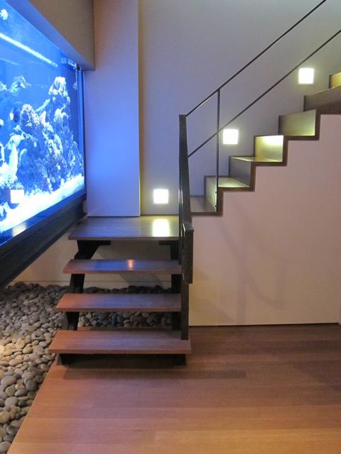
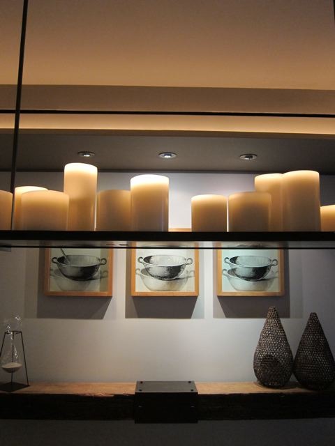
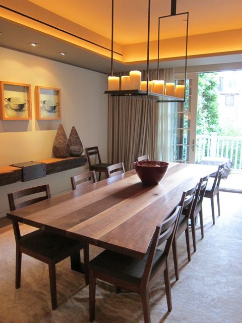
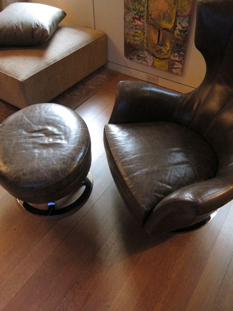
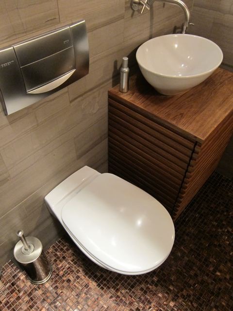
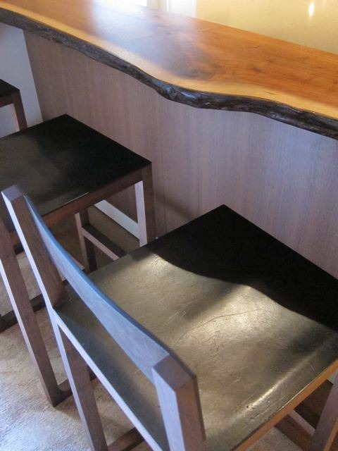
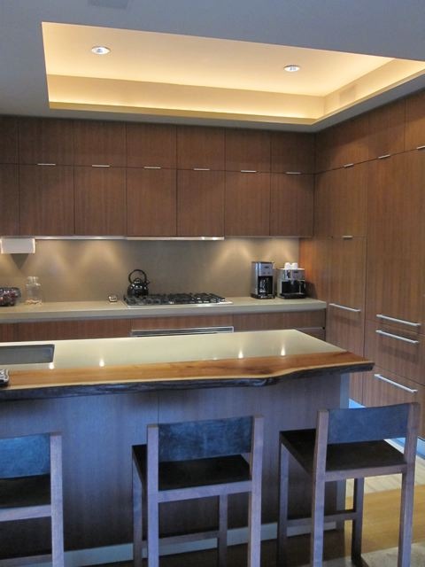
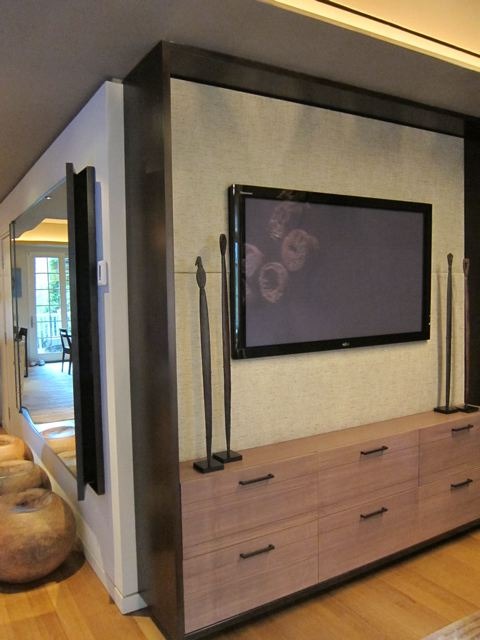
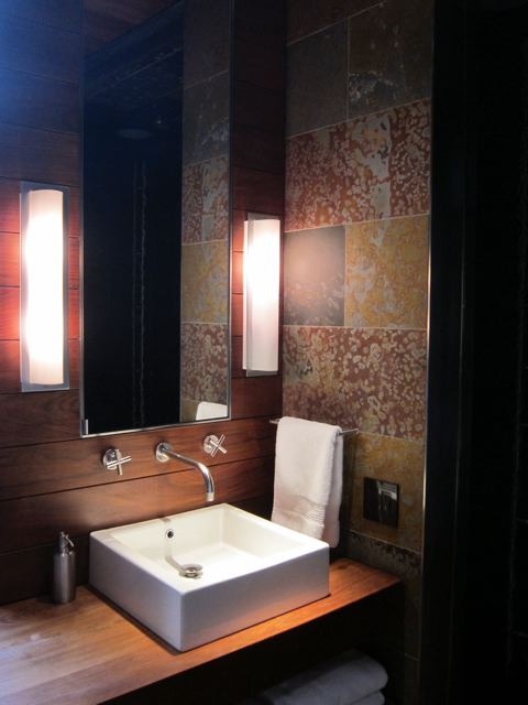
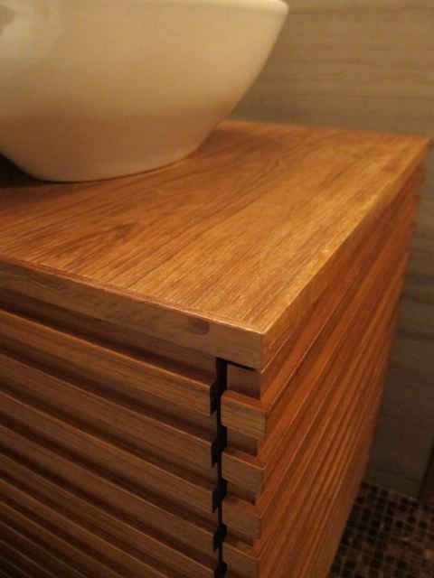
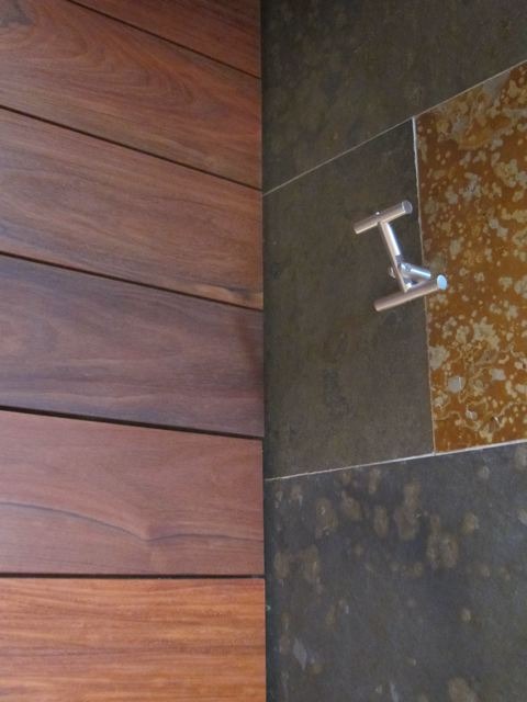
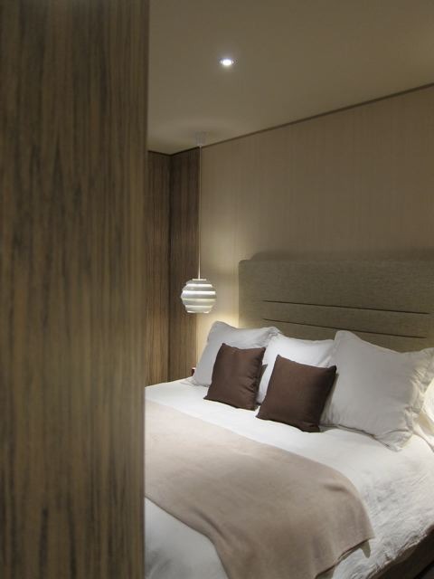
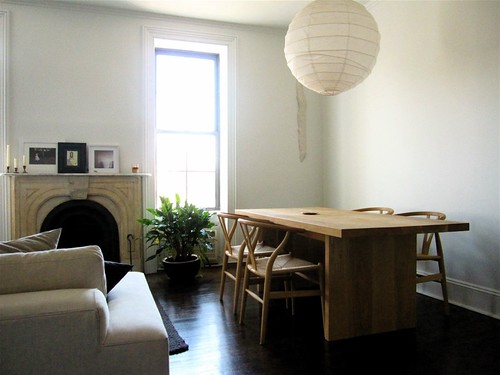
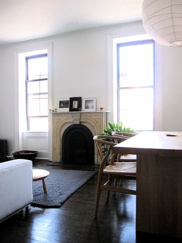
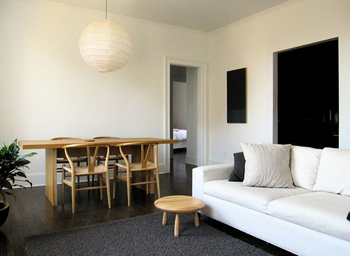
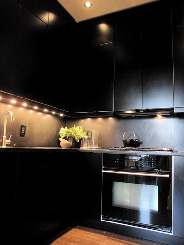
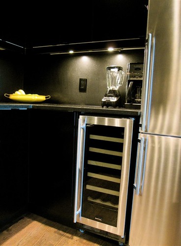
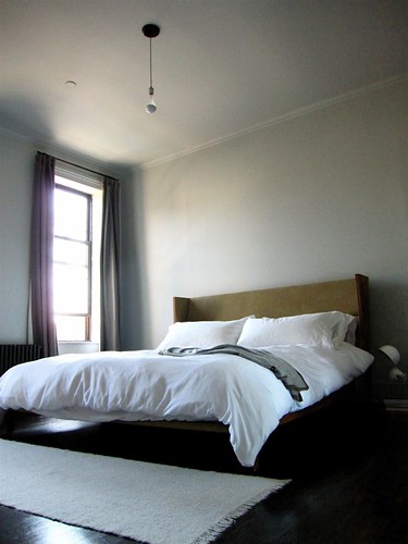
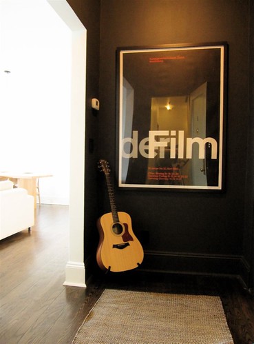
The interiors by Larah Moravek look so fantastic. It's as gorgeous as down-to-earth gets. Warm and inviting. The space features beautifully custom-designed cozy baquettes. Larah also designed those divine lighting fixtures on the ceiling (in first photo) made from steel tubing. Materials from the original landmark building were repurposed as wood paneling for "The Grange" (back dining room/event space). Old license plates from the 30s and 40s that were found in the basement were used as wall decor. Even the buidling's old boiler tank was upcycled as a planter (seen through the back window). There was a high level of sensitivity to the building's rich history that remains in the new space. The interiors have an earthy, restrained elegance. It's been a great journey seeing all the sketches and swatches take form. It's been so exciting to take part in the design and work in tandem with such a talent.

Another reason to look forward to dining there is the menu prepared by Chef Colin Kruzic – formerly of James in Brooklyn and Bouley among others. The menus are currently available for download on The Goodwin splash page. Or if you are in New York City, definitely stop by. 

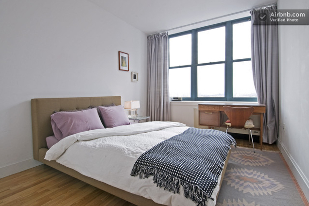
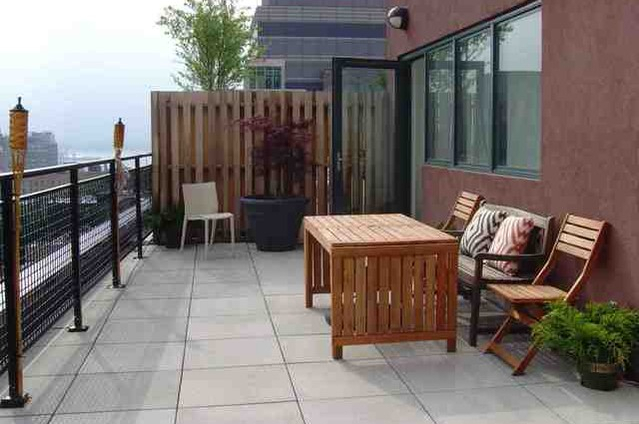
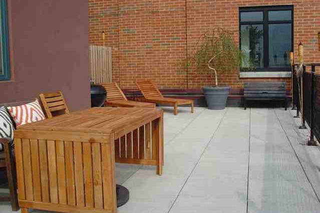
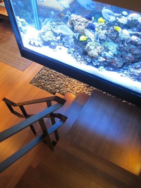
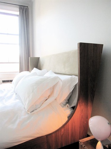
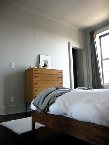
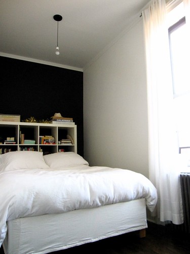
Here are a few photos below of the space (from today's Thrillist NYC write up). View a previous post on the branding/identity design development for The Goodwin here. The full website is coming soon. 

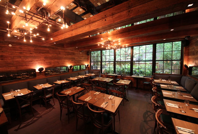
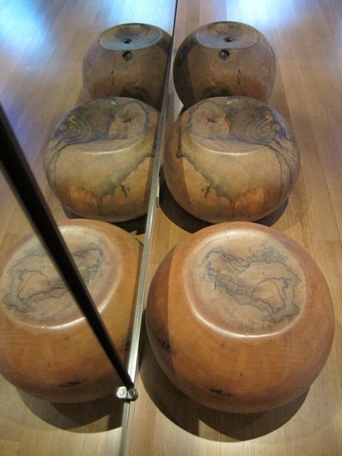
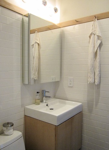
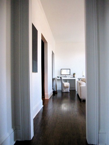
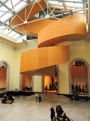
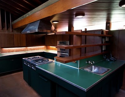
Photos above from Thrillist NYC
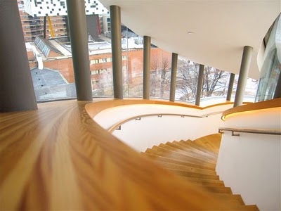
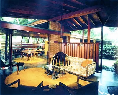
 

art in architecture : new york

Here are some of the things that caught my eye this past month in New York. The architecture is often as interesting as the art. It's really about our points of view as well as the way we edit down to the essence.

Left to right, from the top: 

MoMA (from the inside out)
A Brooklyn apartment building entrance
"Everything's going to be all right" – stairwell at the Ace Hotel
MoMA (from the outside)
Older woman seated at Bertoia chairs at the MoMA
Stairwell, Citibank office on 34th and Broadway
Passage (study) made of NYC police barrier, butterflies made of found aluminum cans by artist Paul Villinski 
Seated ballerinas at Alvin Ailey 
Stairs at Museum of Art & Design 

A few more to come.

a clean slate

I can hardly believe that after the massive upheaval my life has undergone this past year, I have finally moved into my own Toronto digs. In more ways than one, this is my clean slate. It's the official start in my new city. What proved to be a stressful process resulted in a place that's precisely what I wanted (and more). It's all thanks to a fantastic real estate agent and serendipity. Not only is this condo/building brand new, it comes with great amenities, it's very close to work and it has the all-important ensuite washer/dryer. The space also has nice finishes. I love how sunny and airy the space is despite it's relatively modest size (under 600 sq. ft + 100 sq. ft of balcony). I now understand the draw of living up high. The big balcony is perfect for admiring the VIEW. And to my New York friends, it's for A LOT less rent than anything comparable in New York City or Brooklyn. Which is amazing. 

This blank canvas is already my newest design project. I cannot wait to decorate it. As you can see, I don't really have any furniture yet! Now that I've decided to start from scratch, the possibilities are endless. All I know right now is that I will keep things very simple and very comfortable. Stylistically, warm modernism is what I am most drawn to. The older I get, the more important quality and craftsmanship become, too. The challenge will always be finding a balance between quality and price. The task of careful furniture selection is probably what I'm looking forward to the most. It's so exciting! So there will undoubtedly be upcoming (fun) blog posts on home design :) 


The west facing balcony presents a view of the lake (to the left)...

...and neighbourhood views (and the sunset!) to the right

airbnb and my temporary penthouse

I knew going into this New York trip – my first "holiday" in quite some time – that I wanted to stay somewhere nice. Not over-the-top luxury (as if I could afford that), but I wanted something less ordinary. After a search which included discounted rates through a travel insider friend, I found this gorgeous penthouse condo in Brooklyn Heights on Airbnb. The rate turned out to be less expensive than even a run-of-the-mill hotel ($107CND). It was perfectly located between quite a number of train lines and close to the wedding I planned to attend. And you know what? In real life, it looks just as it does in these photos. The space is flooded with light, thanks to the enourmous South facing windows. I had my own private bathroom. It was immaculately clean, I was given access to their washer/dryer, kitchen, living room and terrace, too. The sweet couple who own this condo have their quarters on the opposite side of the condo and really gave me a lot of privacy and were very hospitable. I was even free to bring guests in. And what a view to wake up to! 

If you're thinking of renting this gorgeous space next time you're in Brooklyn, however, I'm afraid it's too late... Over a lengthy conversation with one of the owners one morning, I learned that they've just sold the place for a cool $1.2M. As it turns out, I would be their second to last guest. 

It was such a treat getting to stay in this beautiful space during what was a really great week long visit to my old city. I highly recommend Airbnb. It's worth combing through the site for the best listings. It helped knowing the neighbourhood well already, but ask lots of questions if you don't. I wouldn't hesitate to use it again – no matter where in the world I might end up next!  


All above images via airbnb.com

The photos I took of the (almost) 180°view from the terrace

the fictional suburbia of ross racine

Walnut Village, 2006

I'm fascinated by the work on Montreal artist, Ross Racine. These fictional suburban landscapes are digital drawings, not photographs. It calls to mind the idea of utopian societies. There is also a kind of darkness and subversion to the work of the science fiction novel variety. I have both a fascination and an aversion to that cookie-cutter, Stepford Wives kind of suburban idealism. Which makes the aerial point of view of these constructed landscapes so interesting. Everything looks perfect, abstract and safe from this distance.

inspired tiling : dune by urban product

Yesterday, I discovered these beautiful tiles at a local espresso bar here in Toronto. Urban Product is the company behind them. The tiles, appropriately named Dune, can be custom made to any scale, made from hardwood, plaster or cast concrete and can be installed indoors or out. This would be a great way to incorporate texture and 'landscape' indoors. I love the idea of the hardwood tiles used instead of a headboard for my bed or to cover one entire whole wall. Gorgeous, no?  


inspired pattern experiments

These beautiful, experimental patterns were created by Yale School of architecture student, Elijah Porter. These drawings were originally conceived in three dimensions as potential constructed landscapes. I responded to them aesthetically – as a graphic designer. I love the delicate quality of the lines, the overall texture and composition. The forms are reminiscent of flowers and jellyfish. This would be so amazing as large wall murals – or even as animations. 


inspired warm modernism : by larah v moravek


This stunning West Village brownstone in New York city was designed by my dear, dear friend, Larah V. Moravek. I could not wait to feature her work. This coincides with the launch of her new website (which I helped bring to life). 

How GORGEOUS is this apartment? Everything from the colour palette to that fish tank that's suspended from the ceiling is breathtaking. It embodies that warm modernist aesthetic to perfection. 

My favourite details in the space would have to be: 
1)  The petrified wood slices featured on the living room walls– from the Pucci showroom
2) The suspended fish tank – has steel beams built into the ceiling to support 10,000 lbs of weight. The tank also has it's own service equipment room measuring 5x6 feet.
3) The free edge wood slab counter top in the kitchen – from Memphis Woodworking and came from a tree in Maine; intersects a marble counter top and has a 10" overhang allowing people to sit at the bar. 

Suffice it to say, I know who will be designing my own apartment one day. 

building charm : one street in toronto

I'm taking notice of the variety of architectural styles in Toronto – particularly on one street in my sister's
neighbourhood. For someone who's accustomed to being around Brooklyn's brownstones or taller apartment
buildings, the idea of free-standing houses seems pretty novel in an urban setting (although the city does
have it's share of it's own row-house style, Victorian buildings). Toronto has many quiet suburban-like 
neighbourhoods right in what's considered "downtown." I documented a few of them (all on one street).
Adorable, right? I might have to find one to call my own...


This one is still under construction – reminds me very much of west coast architecture

This might be the smallest one on the block! Love the trellis entrance.

visual acoustics : the modernism of julius shulman

I finally got to see the documentary film Visual Acoustics, The Modernism of Julius Shulman. Julius Shulman passed away last year
(July) after a lifetime of photographic work. He did become the most important architectural photographer in history. He had a huge role
in making modern architecture what it is today. This film was as inspiring and interesting as it was entertaining. If you haven't seen it, DO.  

His most iconic photograph: Pierre Koenig's Case Study House No. 22 

inspired minimalism : the spencer apartment

This past weekend, I had a chance to photograph the Brooklyn apartment of my friend and interior designer, Juliette Spencer. This is the apartment she shares with her husband, Cass – both are originally from the UK. I fell in love with the impeccably designed space after attending her birthday dinner party last month.

They bought the two-bedroom apartment and gut renovated it in 2009. Juliette kept the palette monochromatic, staying true to her own sensibility. The idea was to keep it simple and minimal – which was key to making the space very comfortable for them. All of the furniture was chosen with this in mind. She opened up the closets and installed full height doors with pivot hinges to maximize storage space. The British couple installed European style appliances to give the kitchen more space. The black cabinetry was chosen to emphasize the ceiling height. The idea behind the black kitchen and entrance was that once the lights were off, these spaces would disappear when you're relaxing in the living room area. I loved this idea of "invisible" architecture.

Aside from the gorgeous Hans Wegner wishbone chairs for the dining room, I adored their gorgeous, modern De La Espada bed! The building also has a lovely roof deck space with a 360° view of Brooklyn.

Thanks to Juliette for allowing me to document their beautiful apartment.


IMG_1637.jpg

IMG_1638.jpg


All photos by myturtleneck

dreaming of summer and pool houses part 2

While Brooklyn is, yet again, covered in snow, I'm dreaming of owning this pool house. My long-standing affinity for swimming pools started early in life. I can only think of my aunt's kidney shaped pool with the cantilevered wrap-around veranda around it. I wanted to live there. I would do anything to escape the wintery weather right now...

Check out my previous pool house post too.


Photos and Winton Pool House Design by Hariri and Hariri on Flickr

how to find the new york panorama in queens

My first visit to the Queens Museum sometime last year. I was flipping through some (blurry) images I took of the New York Panorama Exhibit recently and decided to find better images of it to share. The Panorama of The City of New York was originally built for the 1964 World's Fair. I was pretty amazed at this massive architectural model of virtually every detail of the city. Additions have been added over the years (including a model of Citifield in 2009). It's an exhibit that's easily forgotten when living here in New York. But it really is a sight to se if you haven't already.

Photos from the Queens Museum website.


tropical architecture : colors

It's been a while since I shared images from my Flickr pool, Tropical Architecture. I think I was inspired in part by my friend Nichole's recent blog post, Metro Rainbow. It also doesn't help that I am aching for warmer weather and can't help but daydream of visiting some tropical locale, wear summer dresses and sandals. I thought this selection of images would be nice to look at on a chilly Monday morning.

If you're on Flickr and have some images of warmer places, please do join and share. Learn more about the group here.


one of my own from Hawaii

transported ancestral architecture

My Aunt Rose moved back to the Manila from San Francisco after she married and had a couple of kids (back in the 90s). During a visit to her father's ancestral town of Vigan, she had an idea – a monstrous undertaking only possible in places like the Philippines. Vigan is a town well-known for it's Spanish colonial architecture. In fact, since the 18th and 19th century, it has retained the most of the colonial architecture of any city in the Philippines. It is gorgeous and quaint. And yes, people still use horse-drawn carriages in the Philippines (called kalesa).

During my Tita Rose's visit to Vigan (tita means aunt in Tagalog), she heard about a house and land up for sale there. She heard the house was to be demolished. After going to see the house, she decided to purchase just the house and get this: took the house apart – every bit – and transported it back to Manila (I believe by truck, then boat) and rebuilt it next to a river outside of the city! It was a five plus year undertaking. One that that would have cost ridiculous amounts of money in any other country. You have to take into consideration that the Philippines is made up of over 7,000 islands. Transporting anything is an undertaking. The house was rebuilt on a plot of land overlooking a river. Various parts of the original house were repurposed as pieces of furniture (i.e. solid wood wall panels as the new dining table and front door, banisters as new bed posts, etc.). It's incredible.

So a few years ago, my sister Caroline (among numerous other talents, is a photographer) photographed the house for a local magazine. The house is often rented out for film, television commercials and photo shoots. The other images below are ones I took during my last visit a couple of years ago. Please click to enlarge the images (they are huge).

My Tita Rose's house was an amazing feat. It was a project of a lifetime, an amazing contribution to cultural preservation. Her creativity and ingenuity are an inspiration. She's not even a trained designer – she is a social worker, counselor and unlike 95% of Filipinos, a devout Buddhist who often goes on silent meditation retreats for up to 60 days. That's right. Sixty. She has this tranquil intelligence about her and she's incredibly kind. I love that she had a rooster, dogs and a cat running around the house the day we were there for a visit!


These are some examples of Vigan architecture.


I love the hammocks-turned-chairs

Capiz shell dividers and antique furniture


eero saarinen's : his life's work


I loved seeing the Eero Saarinen exhibit at the Museum of the City of New York this past weekend. Once I saw the show, it completely made sense that the city would curate a show about him. No only was he one of the most prolific, influential architect/designers of the last century, I had no idea he design so many buildings in New York. His second wife, Alin, was also a prominent New York journalist. The show not only showcased his life's work, his process but also gave us all a little bit more of a story about his life. I adored the love letters he wrote/drew for his wife (directly above). It was amazing to see the rough sketches, models and photographs of his work too. I particularly love the design of the TWA terminal at JFK (now closed, but it could potentially be redesigned and reopened again). It is really worth seeing.


frank gehry : the art gallery of ontario


I was in awe of Frank Gehry's design of the Art Gallery of Ontario (AGO) in Toronto. I do love those unapologetic curves in his work. As a sidenote, I appreciated his work much more after seeing the documentary Sketches of Frank Ghery. The best space in the gallery is Galleria Italia (see the first two photos above). It is breathtaking. Gehry also designed the most beautiful wheelchair access ramp I've ever seen (see photos 3-6). I must mention, too, that the art collection in the gallery was really impressive. It's really worth a visit.


a single man and his house


I was so impressed with Tom Ford's A Single Man. I saw it last night. An impeccably dresses Colin Firth delivered an amazing performance – worthy of the Best Actor award at the Venice Film Festival and recent Golden Globe nod. The film was so well done. Much respect to Tom Ford for his direction, screenplay writing of the film. WOW. There was also a lot of eye candy (mostly male), some well-framed shots showcasing beautiful clothing and faces (of course) and beautiful cinematography. I loved the subtle (and selective) taking away and adding of color saturation depending on the mood of Colin Firth's character. Interesting that women were almost always shown in full color saturation. Anyway, such a gorgeous film and love story.

One element of the film that I really appreciated was the house that Colin Firth's character (George) and his lover lived in. My jaws dropped during the first few scenes. What an amazing house. After a bit of a search online for some information on the house, I learned that architect John Edward Lautner designed it. The Schaffer house (a private residence) is considered to be a triangle modernist style — I'd never heard of this before. I was also thrilled to find out that it's located in Glendale, CA where we lived when I was young.

**Update** I just learned that the house is up for sale for $1.5 million. See listing. Wow, I wish!

View my previous post on A Single Man the trailer here.

All architecture images from here and here.

inspired transformations : was/is

Featured in this week's New York magazine are several home design transformations entitled Home Design Fall '09: Was/Is. Below are two of my favorites: The Wall Vanishes and The Pastoral Porch.

The first is an abandoned East Village brownstone building transformed into an amazing condo with a vanishing wall. The before and after photos are incredible! It's difficult to see in the photo, but there's actually a glass fence that acts as a barrier from the outside for when the wall "disappears." I love it.

The interior of the building AFTER (scroll down to see BEFORE image)

The front of the building BEFORE
The front of the building AFTER
The interior of the building BEFORE

The second example, The Pastoral Porch, is a barren brick terrace turned living garden designed and built by a veteran green builder and furniture designer. The porch is now filled with vegetables and herbs that can be harvested year-round. I love the innovation that happens in New York where space is so limited.

All images from NYmag

Check New York magazine to read the full article and see additional examples.