bar

the goodwin nyc


Earlier this year, an immensely talented interior designer and friend, Larah Moravek, told me about a restaurant/bar project she was working on in New York. She asked to see whether I might be interested in working on the branding for it. The owners were also interested in working with me and I didn't even hesitate. This was the type of a project that I wanted to work on but don't often get a chance. Particularly, when I know the interior design is guaranteed to be fantastic.

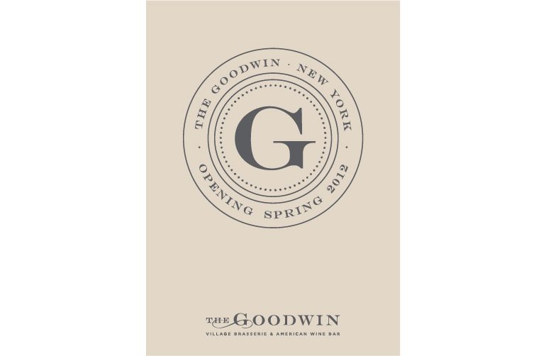
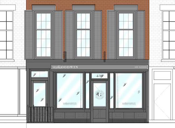
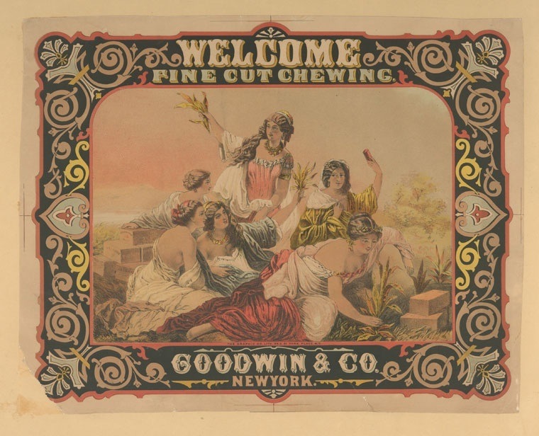
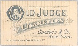
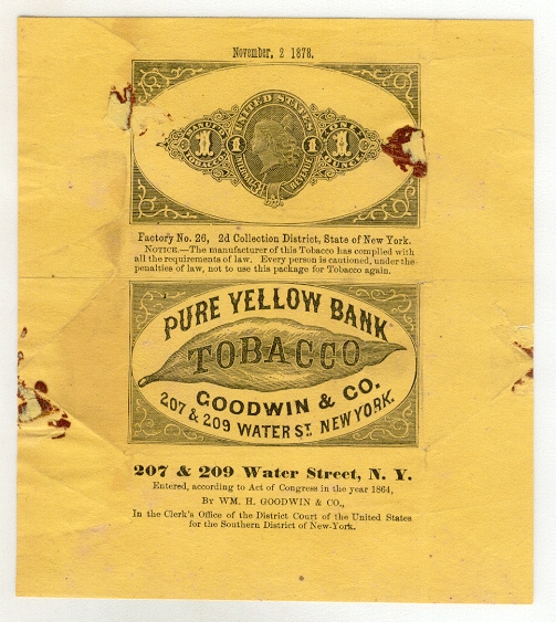
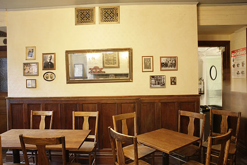
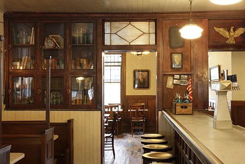
The Goodwin will be located in a brownstone building on Hudson Street in the West Village and is slated to open next year. The interior space is currently being gut-renovated and reconfigured. I began the design process in July of this year. I first learned about the history behind the selection of the name. Apparently, the restaurant is located on land where there used to be a 300 acre tabacco farm. The name of the tabacco company was Goodwin & Co. This illustration below (an ad) was given to me by the owners as inspiration. The owners wanted to capture and essence of the location and name's history while making it modern. This is in line with the direction for the interior design of the space. 


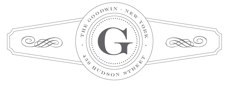
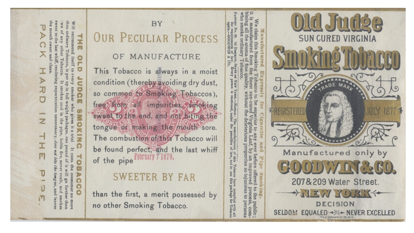
I decided to do a lot more research, visually and otherwise, about the Goodwin & Co. I looked at typographic treatment, packaging design and layout of all the reference material I found from the same era. I also looked at cigar labels and loved the unique shapes they came in. I really wanted to capture the history while making it clean, modern and relevant. 

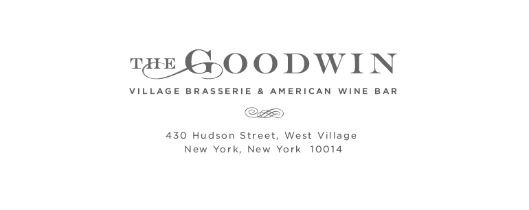
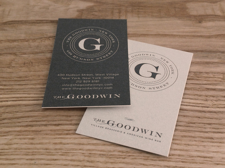
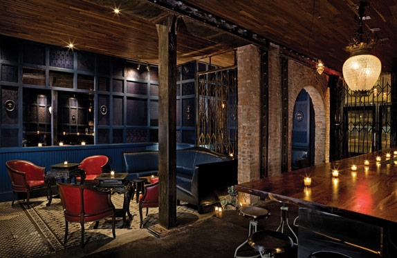
The client LOVED the result. They felt I had captured what they wanted right away. Needless to say, I was thrilled. We ended up on the 'crest' as well as a wordmark. I am about to start working on the stationery system, menu design, website, etc. So this is really just the beginning. I don't often share my own work here on my blog but this was one I am particularly excited about. The storefront window posters and awning have been installed as the construction continues so I am now finally able to share this work. I will post more results later in the process! Also view this project in my portfolio identity case studies


inspired at madame geneva


I attended a good friend's going away party at Madame Geneva a couple of weeks ago. It was another instance where I thought: "How did I not know about this place?!?" It is a gorgeous bar. It's adjacent to and is by the people behind Double Crown next door. I believe both are designed and owned by AvroKo, the company behind Public. It's small, dark, cavernous and sexy. The kind of place you could imagine trysts would be happening at all hours of the night and any day of the week. The crowd did not look too young (a plus for me). I also love a bar with a good bar menu. This one is colonial Asian inspired and well done. I particularly liked the duck steamed buns (they are more like rolls). They were so delicious. As I sipped cocktails, devoured steamed buns and chatted with friends that night, I realized that I just found a new favourite spot.

Madame Geneva


Madame Geneva

Madame Geneva

Madame Geneva


Madame Geneva
Click on photos to see source


inspired room for cocktails : weather up


Saturday night was all about a couple of my neighborhood favorite spots: No.7 restaurant and Weather Up bar. They never disappoint. Weather Up truly offers artfully prepared cocktails. They really take their cocktails very seriously. Having a drink made by one of their dapper bartenders could be considered a production. They move carefully, deliberately and prepare your cocktail with love – similar to they way a chef would a treasured dish. I've always loved the interior design of this tiny space. The white ceiling tiles highlight the length and shape of the room – giving it an old subway station feel. The lighting design compliments all of this and gives the space a beautiful warm glow. In addition to all this, I like that the bar attracts a variety of people which always makes things more interesting. I'm looking forward to summer months when they have their lovely back patio space open.
This bartender laughed at the photo I took because I caught him taking a quick break. I liked the contrast of the warmth of the space to the blue light glowing from his iPhone.


all photos by myturtleneck


a gem in cobble hill : henry public


Henry Public in Cobble Hill was where I spent my Saturday night this past weekend. I had been wanting to try it since they opened in the fall. Great little bar and the staff was incredibly sweet. It felt very much like an authentic nineteenth century speakeasy – which is what they were going for. Nothing about this place was pretentious. A friend in the film world tells me the producer of Fantastic Mr. Fox, Jeremy Dawson, is part owner. I can actually see this place as Wes Anderson set. Interior design aside, I also loved their well-considered (and very small) menu of comfort food. The grilled cheese sandwich with apples was so worth braving the cold for!


apotheke: great concept, great execution


My previous post about the Alembic Bar identity design reminded me of my favourite absinthe bar in Manhattan, Apotheke (which I believe, is the German word for apothecary) that opened during Fashion Week in '08. I had the privilege of going for a private event the week before it officially opened it's doors. The two names are related: an alembic is a vessel used in the distillation process often used in apothecaries or perfumeries. 
Apotheke is more than an absinthe bar. The concept behind it and the name is carried all the way through — which is what I love about it. It's more than a bar, it's a "cocktail apothecary". It's the first of it's kind. It is a place that one might find unique drink concoctions designed to soothe whatever might be ailing them. There are exotic herbs, fruit and essential oils thoughtfully infused in their (apparently, trés expensive) cocktails. Delicious, however... in more ways than one. They think of the bar as a chemistry lab or even a stage. 
The interior design carries through the concept as well. Located in a former opium den (among a host of other shady previous lives), it's history makes this place all the more intriguing. The shelf behind the bar instantly reminded me of the Fragonard Perfume Museum in Paris which I loved. I happen to go while in Paris in '05 because I was researching perfume and essential oils for a client at the time. Apotheke is the darker, sexier version of the museum. Everything from floor to ceiling was well considered without looking over the top. Even the light fixtures are made from old beakers. Love it! I had the most amazing (flaming) shot of absinthe there. I must stop by again soon. Go check it out!